How to read a flamegraph
You’ve run a profiler, say async-profiler, and now you’re looking at a flamegraph. It’s one of the best ways to understand where a program spends its time, as long as you know the reading rules. There are only a few. Then we put them to work on six real graphs, all taken from the same application.
What each axis means
A flamegraph aggregates thousands of stack samples. Each rectangle is a frame, that is, a method.
- Width: the share of samples in which this method was present on the stack. The wider, the more time the program spent there (CPU or wall-clock, depending on what you measured). It’s the only dimension that matters for prioritising.
- Height: the depth of the call stack. A frame sitting on another is a call: the one below called the one above.
- Colour: it depends on the tool. In classic flamegraphs (Brendan Gregg’s script, most viewers), hues are picked at random to tell neighbouring blocks apart. In the HTML that async-profiler produces, colour has a precise meaning. We come back to it right after.
async-profiler’s colours
async-profiler’s HTML colours each frame by its type. The legend is behind the ? button at the top left of the graph:
| Colour | What it is |
|---|---|
| Green | Java method compiled by the JIT (C2) |
| Light green | Java method compiled by C1 |
| Pale green | Interpreted Java method |
| Cyan | Java method inlined into another |
| Yellow | C++ code of the JVM itself |
| Red | Native code (libc, JNI, libjvm without symbols) |
| Orange | Linux kernel |
It gets quick to read with a little practice. A yellow stack under your code is the JVM working for you (locks, GC, JIT). A red plateau at the very top is native: an array copy, a system call, an external library. And a lot of pale green is code still running in interpreted mode, so an application that hasn’t warmed up yet.
Two modes change how you read the top. In allocation mode, the top frame is the class of the allocated object, in cyan. In lock mode, it’s the class of the lock.
The classic trap: horizontal is not time
This is the mistake we see most often. From left to right, there is no chronology. Frames on the same level are just sorted alphabetically so identical stacks get merged. A method on the far right doesn’t run “after” the one on the left. A flamegraph answers “where does the time go?”, not “in what order?”. For chronology you need another tool, a trace or a timeline.
A first graph, read together
The example application is described in the async-profiler article. In short: four worker threads process orders in a loop. For each order, validate checks email addresses, report builds a text, and save calls a fake database. Three problems were planted on purpose. Here is the CPU profile, fifteen seconds of sampling.
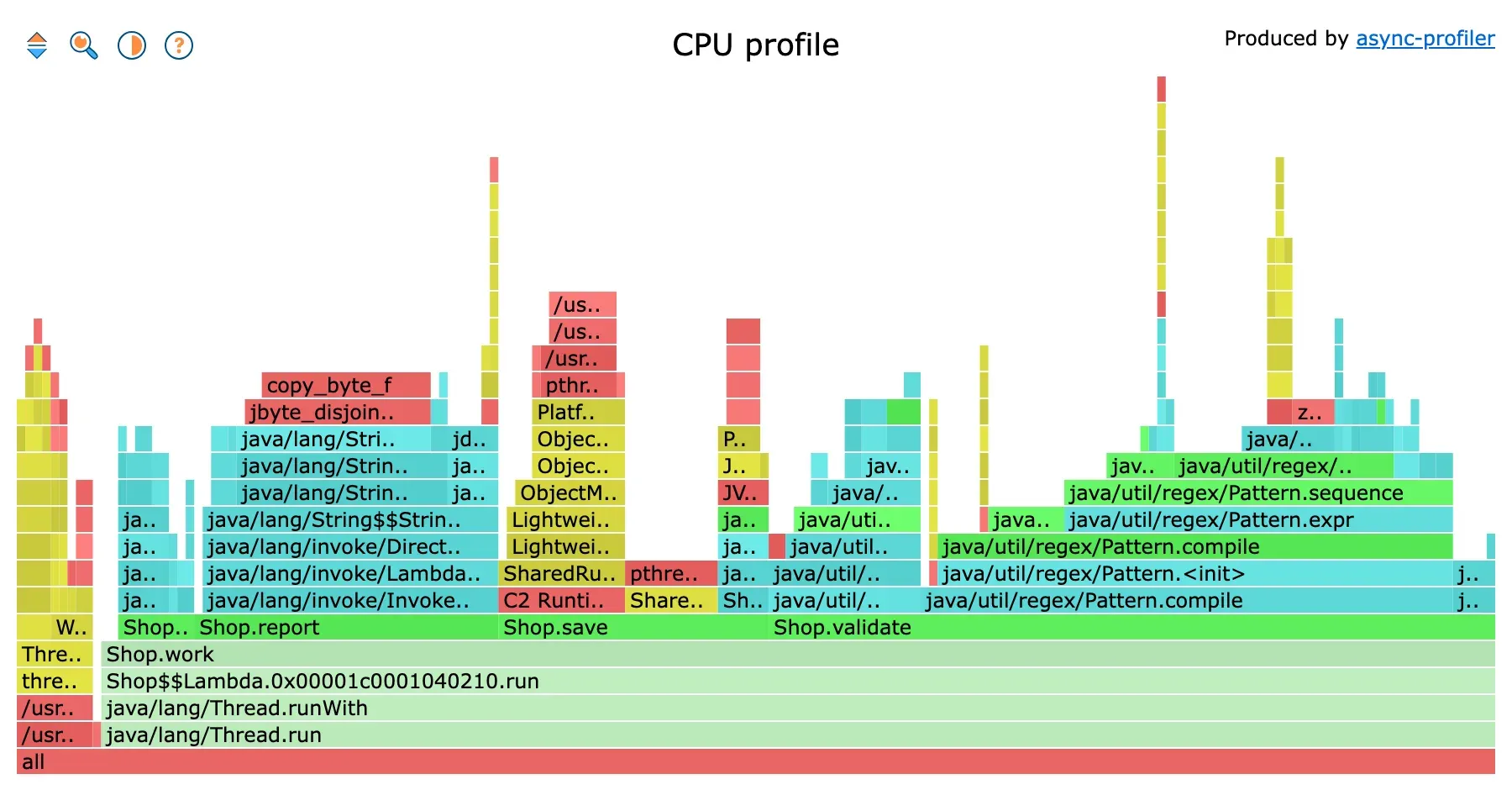
CPU profile, before the fix. The middle block is Shop.save, the right one Shop.validate.
Read from the bottom up. At the very bottom, all, every sample. Just above, Thread.run and Shop.work take almost the full width: that’s normal, all the work starts there. This wide base says nothing, except that the program does what it’s asked.
The next level is the one that counts. Shop.work splits into three blocks: Shop.validate on the right, Shop.save in the middle, Shop.report on the left. Hovering over each, the graph shows its share: 49% for validate, 21% for report, 18% for save. That’s the prioritisation, done in three hovers.
Then we go up. Above validate, almost everything is in Pattern.compile. The regex is compiled on every call, and the program spends 36% of its CPU there. The Matcher.matches frame, the one doing the real work, is tiny next to it. Above report, we go through String$$StringConcat and String.getBytes, then a red plateau: copy_byte_f, a native memory copy. That’s the signature of a string built by concatenation in a loop. Above save, yellow: ObjectMonitor::enter, the JVM handling a contended lock.
On the far left, a narrow column that doesn’t start from Thread.run: those are the GC and JVM threads, 5% of the total. And above the regex, a few thin, tall yellow towers: OptoRuntime::new_array_C, the slow allocation path, when the JVM has to hand a new memory block to the thread. Thin, so cheap. We ignore them.
In practice: look for plateaus
The method that works, on this graph as on any other:
- Start at the top and spot the wide frames. The top of a stack is the code that was actually running when the sample was taken (its “self time”). A wide plateau at the top is time burned right there. First suspect.
- Go back down to understand the path. Following a wide frame downwards shows who led there. Very often the culprit isn’t the leaf itself, but the fact that it’s called far too much, from higher up.
copy_byte_fhas nothing to be blamed for.Shop.reportdoes. - Ignore thin, isolated towers. A narrow, very tall stack costs little: many nested calls, but little total time. Not a priority.
The rule to keep in mind: width says how much it costs, position at the top says where it’s actually spent.
The reversed view
The classic graph starts from the threads and climbs to the leaves. Sometimes you want the opposite: start from a hot leaf and find out who calls it. That’s the reversed view, produced with --reverse at generation time, or with the first button at the top left of the HTML (key I). It’s drawn as an “icicle”, the stacks hang downwards.
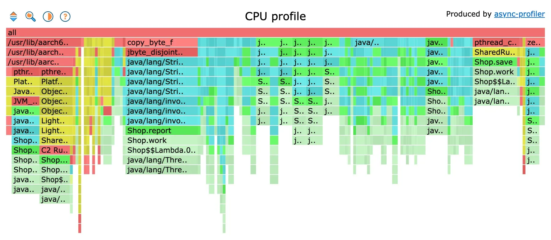
The same CPU profile, reversed. Each column starts from a leaf and goes down to its callers.
You can see copy_byte_f at the top, and below it the full chain leading to it, down to Shop.report. This view is useful when the same low-level method is called from several places, say JSON serialisation or an equals method called everywhere. The normal graph splits it into ten small blocks. The reversed view groups them.
Search, zoom, filter
Three gestures make a big graph readable.
The magnifier (or Ctrl+F) opens a search. Type a word or a regex, matching frames light up in magenta, and a “Matched” counter shows their total share. It’s the fastest way to answer “how much does everything touching the regex cost?”, even when it’s scattered.
Clicking a frame zooms on it: it takes the full width, and percentages are recomputed relative to it. Clicking all goes back to the start.
Finally, at generation time, --minwidth 1 hides frames under 1%, and -I/-X keep or exclude stacks containing a pattern. On an application with two hundred threads, -I '*worker*' removes everything that isn’t yours.
Wall-clock: width is waiting
The same graph doesn’t read the same way depending on what was measured. Here is the application profiled in wall-clock mode, all threads together, with the -t option that puts the thread name at the base of each stack.
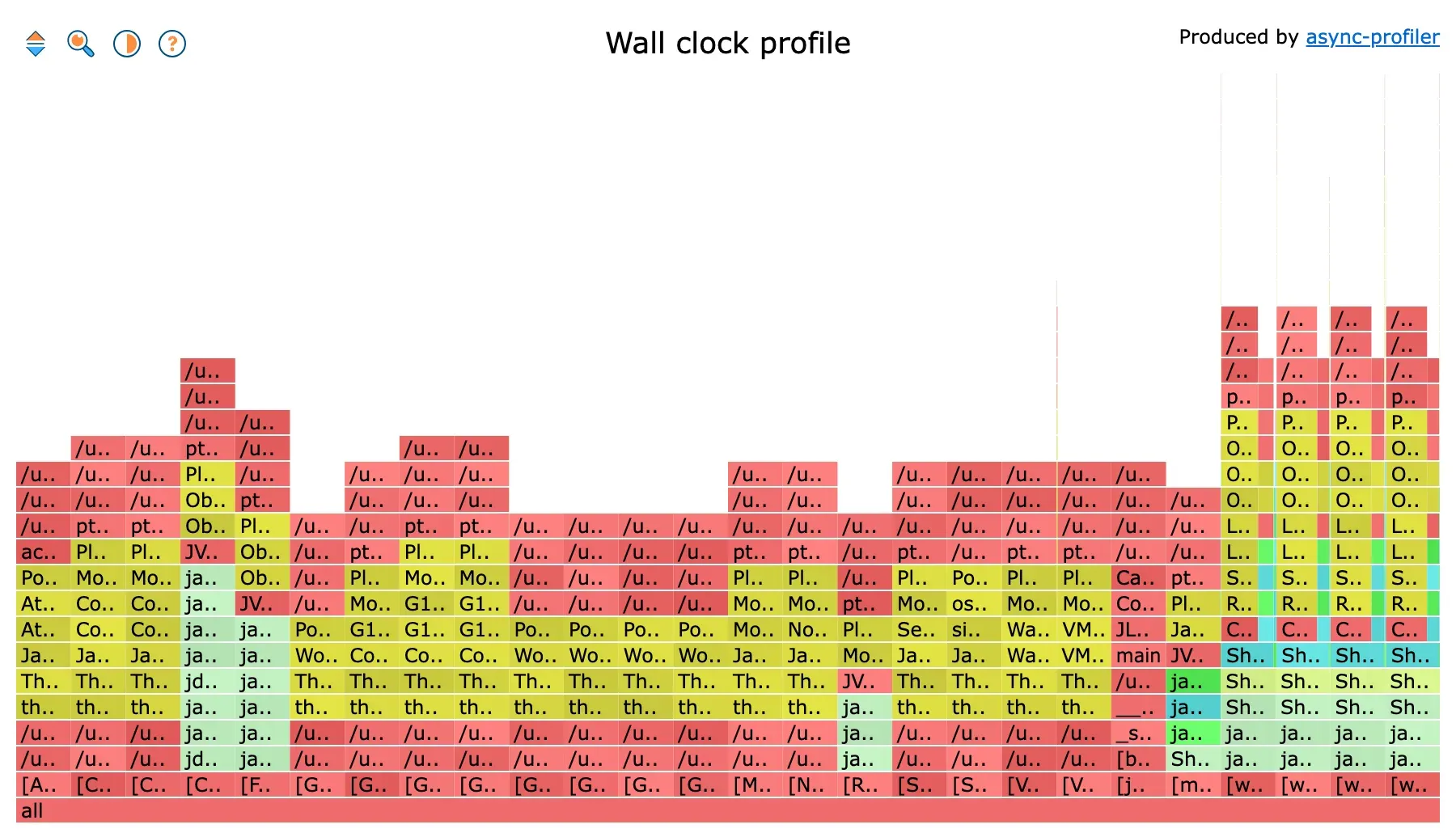
Wall-clock, all threads. Each column is a thread, and they all have the same width.
First surprise: twenty-six columns, all the same width. In wall-clock mode, each thread gets a sample at a fixed interval, whether it works or sleeps. A thread that sleeps for fifteen seconds therefore weighs as much as a thread that computes for fifteen seconds. Here, most columns are JVM threads that wait: GC, compiler, main sleeping, the attach listener. The four columns on the right are the worker threads. The rest is noise.
Hence the reflex: in wall-clock, you filter. The same profile with -I '*worker*':
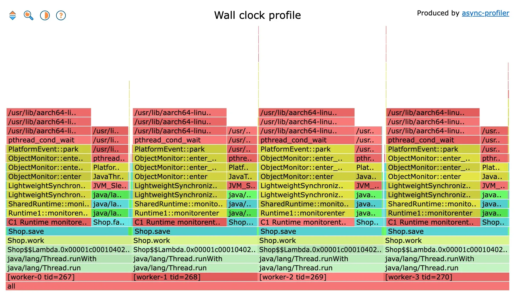
Wall-clock, filtered on the workers. Each worker spends most of its time in Shop.save.
Now it makes sense. Each worker is almost entirely under Shop.save, 97% of its column. Above it, a yellow and red stack: ObjectMonitor::enter, PlatformEvent::park, pthread_cond_wait. The thread isn’t computing, it’s waiting for a lock, and that’s 73% of the graph. A thinner part, on the right of each column, is under Thread.sleep: that’s the fake database, 24%. And the real work, validate and report? A sliver of a few pixels, on the left. In the CPU profile, those two methods made up 70% of the graph. In wall-clock, they make up less than 3%. Both graphs are right. They don’t answer the same question.
On a real service, the waiting frames to know are Unsafe.park (an idle thread pool, or a Future.get), SocketRead or socketRead0 (a network response), and ObjectMonitor::enter (a contended synchronized). A wide frame of that kind is fixed by removing the wait, not by speeding up the code.
Allocations: width is bytes
In allocation mode, width no longer measures time but allocated bytes. And the top frame is the allocated class, not a method.
![Allocation flamegraph: byte[] on top of Shop.report, boolean[] and int[] on top of Shop.validate](/_astro/alloc.DeWE5YS7_Z1UjfIg.webp)
Allocation profile. Under byte[], string concatenation; under boolean[], regex compilation.
Two cyan plateaus at the top. byte[], 47% of the bytes, sitting on StringConcatHelper and Shop.report: every += copies the whole string into a new array. boolean[], 23%, sitting on Pattern$BitClass and Shop.validate: every compilation of the regex builds its character tables. The graph gives the what (the class) and the where (the method) at a glance. That’s exactly what you need to lower the pressure on the GC, the subject of the GC tuning article.
Before, after
Once the three problems are fixed (regex compiled once, StringBuilder, no more global lock), we profile again under the same conditions.
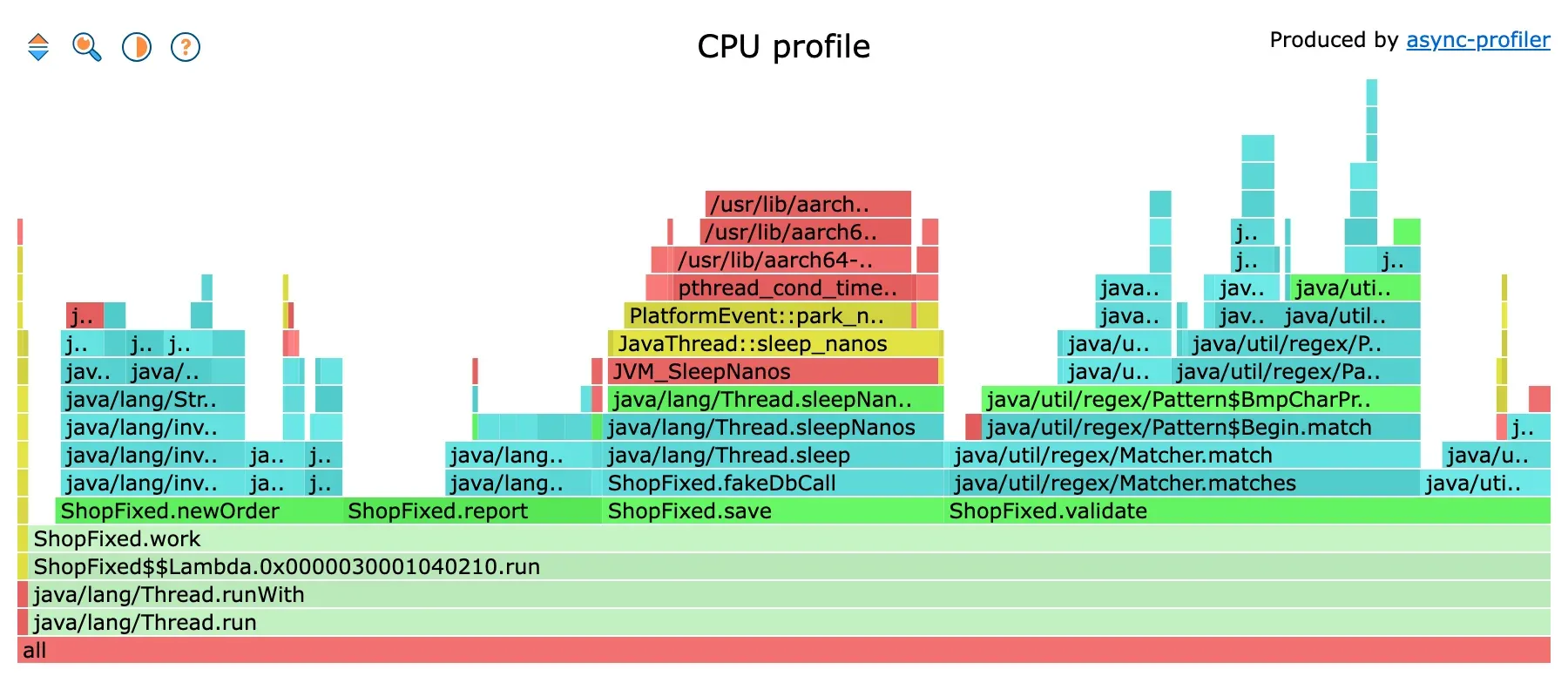
CPU profile, after the fix. Throughput went from 710 to 2,930 orders per second.
The validate block is still there, but it now contains only Matcher.match, the real work. Pattern.compile is gone. The report block has become narrow. And save is now mostly Thread.sleep: the database call. That plateau won’t be fixed in this program. The ceiling is downstream, and the graph says so.
That’s the most useful reading of a profile after an optimisation: check that the plateau you targeted is gone, and look at what became the widest in its place.
A few patterns you learn to spot quickly
- A wide, flat plateau at the very top: a hot method, computation, serialisation, parsing. Directly optimisable.
- A very wide base that branches out upwards: an entry point that scatters time across a crowd of sub-calls. There, look for the common factor rather than a single method. Regex search helps.
- Layers of framework or proxies stacked under your code: often AOP, interceptors, reflection. Normal, except when it gets wide.
- Thin, isolated yellow towers: GC, JIT, JVM service threads. Ignore them as long as they stay thin. If the GC gets wide, it’s no longer a profiling problem but a GC logs one.
- Frames whose name is a file path, like
/usr/lib/.../libc.so.6: a native library without symbols. You know which library you’re in, not which function. That’s the case in most Docker images. It doesn’t stop you from reading the Java frames underneath.
Comparing two profiles
To compare a before and an after, jfrconv can build a differential flamegraph from two profiles, in JFR, HTML or collapsed format:
jfrconv --cpu --diff before.jfr after.jfr diff.html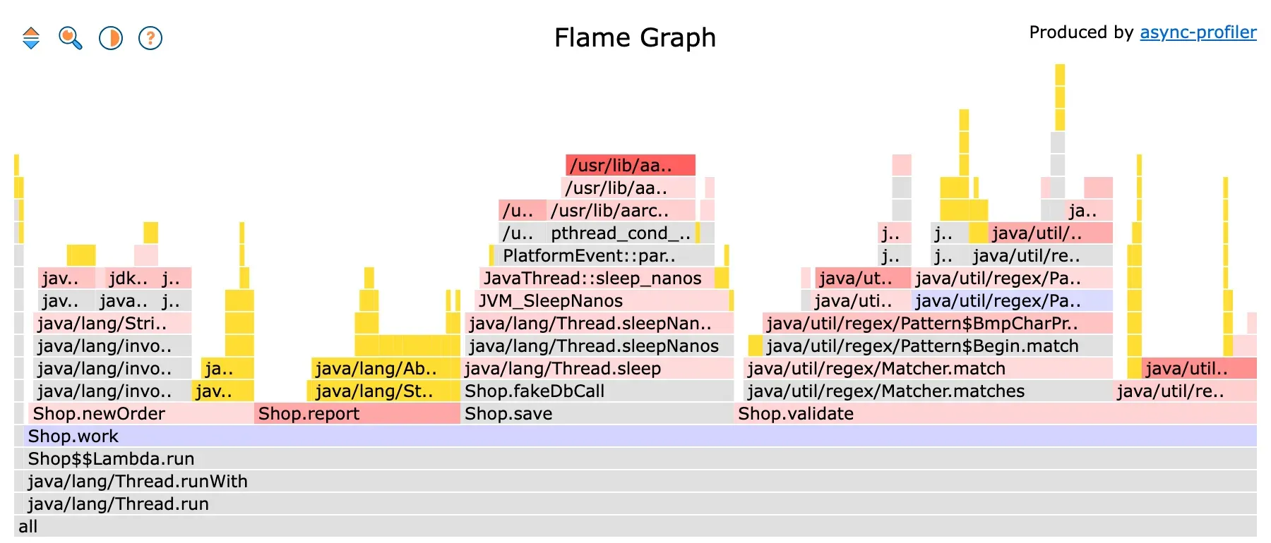
Differential flamegraph, before versus after. Red: more samples than before. Yellow: frames that didn't exist before.
The graph takes the shape of the second profile, the one from after. Each frame is coloured by its difference with the first: red if it has more samples than before, blue if it has fewer, grey if nothing moved, yellow if it didn’t exist at all. The more intense the colour, the bigger the gap, and hovering gives the exact delta. Here, the StringBuilder frames under Shop.report are yellow: that’s new code. And Pattern.compile doesn’t show up, because a frame that exists only in the first profile isn’t drawn. To see what disappeared, build the graph again with the two files swapped.
One condition for this to work: both profiles must have been taken under the same conditions. Same duration, same load, same event. Otherwise the differences measure the difference in load, not the difference in code.
In short
Look for the wide, start at the top, don’t read the horizontal as a clock, and remember what the profiled event means. In CPU, a wide frame is computation. In wall-clock, it’s often a wait, and you have to filter out idle threads before reading. In allocation, it’s bytes, and the top frame is a class.
async-profiler’s colours help: green for Java, yellow for the JVM, red for native. The reversed view and the search group what the normal graph scatters. And after a fix, profile again to see what became the widest.
If you haven’t generated your own yet: Profiling the JVM with async-profiler.